
Title
Lorem ipsum dolor amet, consectetur magna etiam elit. Etiam sed ultrices.
Say goodbye to impractical store management software. You can use all-in-one cloud-based solution not only to help your business grow, but even to work faster and smarter .
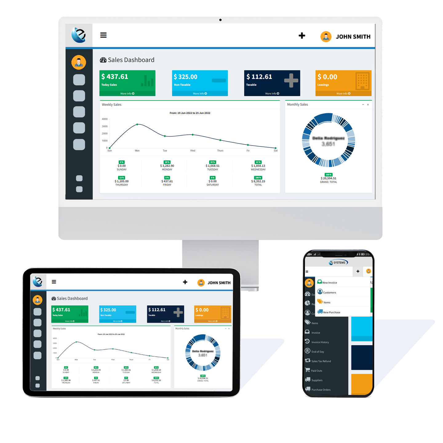
ProAdmin One incorporates tools that help you control your business.
Improve your business, working faster and cleverly with an all-in-one cloud-based solution designed to help you grow your business.
Access cloud-based platform from anywhere, obtain real-time insights directly from your business.
Design and control POs, estimates and more, keep organized and track your techs progress for each job.
This is the best way to appreciate the real-time workflow of your business.
Expand profits using real-time information to make strategic changes.
Get rid of duplicate entry and back office double work.
Obtain estimates quickly and approved by customers fast.
Always be aware of your inventory and track purchase orders easily.
This is a Spotlight element, and it's generally used – as its name implies – to spotlight a particular feature, subject, or pretty much whatever. You can customize its appearance with a number of modifiers, as well as assign it an optional onload or onscroll transition modifier (details).

This is also a Spotlight element, and it's here because this demo would look a bit empty with just one spotlight. Like all spotlights, you can customize its appearance with a number of modifiers, as well as assign it an optional onload or onscroll transition modifier (details).

And yes, this is another Spotlight element, and it's also here because I need to fill a bit of space. Naturally, like any other spotlight, you can customize its appearance with a number of modifiers, as well as assign it an optional onload or onscroll transition modifier (details).

This is a Gallery element. It can behave as a lightbox (when given the lightbox class), and you can customize its appearance with a number of modifiers, as well as assign it an optional onload or onscroll transition modifier (details).
Lorem ipsum dolor amet, consectetur magna etiam elit. Etiam sed ultrices.

Lorem ipsum dolor amet, consectetur magna etiam elit. Etiam sed ultrices.

Lorem ipsum dolor amet, consectetur magna etiam elit. Etiam sed ultrices.

Lorem ipsum dolor amet, consectetur magna etiam elit. Etiam sed ultrices.

Lorem ipsum dolor amet, consectetur magna etiam elit. Etiam sed ultrices.

Lorem ipsum dolor amet, consectetur magna etiam elit. Etiam sed ultrices.

Lorem ipsum dolor amet, consectetur magna etiam elit. Etiam sed ultrices.

Lorem ipsum dolor amet, consectetur magna etiam elit. Etiam sed ultrices.

Lorem ipsum dolor amet, consectetur magna etiam elit. Etiam sed ultrices.

Lorem ipsum dolor amet, consectetur magna etiam elit. Etiam sed ultrices.

Lorem ipsum dolor amet, consectetur magna etiam elit. Etiam sed ultrices.

Lorem ipsum dolor amet, consectetur magna etiam elit. Etiam sed ultrices.
This is an Items element, and it's basically just a grid for organizing items of various types. You can customize its appearance with a number of modifiers, as well as assign it an optional onload or onscroll transition modifier (details).
Lorem ipsum dolor sit amet, consectetur adipiscing elit. Morbi dui turpis, cursus eget orci amet aliquam congue semper. Etiam eget ultrices risus nec tempor elit.
Lorem ipsum dolor sit amet, consectetur adipiscing elit. Morbi dui turpis, cursus eget orci amet aliquam congue semper. Etiam eget ultrices risus nec tempor elit.
Lorem ipsum dolor sit amet, consectetur adipiscing elit. Morbi dui turpis, cursus eget orci amet aliquam congue semper. Etiam eget ultrices risus nec tempor elit.
Lorem ipsum dolor sit amet, consectetur adipiscing elit. Morbi dui turpis, cursus eget orci amet aliquam congue semper. Etiam eget ultrices risus nec tempor elit.
Lorem ipsum dolor sit amet, consectetur adipiscing elit. Morbi dui turpis, cursus eget orci amet aliquam congue semper. Etiam eget ultrices risus nec tempor elit.
Lorem ipsum dolor sit amet, consectetur adipiscing elit. Morbi dui turpis, cursus eget orci amet aliquam congue semper. Etiam eget ultrices risus nec tempor elit.
Lorem ipsum dolor sit amet, consectetur adipiscing elit. Morbi dui turpis, cursus eget orci amet aliquam congue semper. Etiam eget ultrices risus nec tempor elit.
Lorem ipsum dolor sit amet, consectetur adipiscing elit. Morbi dui turpis, cursus eget orci amet aliquam congue semper. Etiam eget ultrices risus nec tempor elit.
Lorem ipsum dolor sit amet, consectetur adipiscing elit. Morbi dui turpis, cursus eget orci amet aliquam congue semper. Etiam eget ultrices risus nec tempor elit.
Lorem ipsum dolor sit amet, consectetur adipiscing elit. Morbi dui turpis, cursus eget orci amet aliquam congue semper. Etiam eget ultrices risus nec tempor elit.
Lorem ipsum dolor sit amet, consectetur adipiscing elit. Morbi dui turpis, cursus eget orci amet aliquam congue semper. Etiam eget ultrices risus nec tempor elit.
Lorem ipsum dolor sit amet, consectetur adipiscing elit. Morbi dui turpis, cursus eget orci amet aliquam congue semper. Etiam eget ultrices risus nec tempor elit.
Finally, here are some additional elements you might find useful (and yup, they look fine with any appearance).
This is bold and this is strong. This is italic and this is emphasized.
This is superscript text and this is subscript text.
This is underlined and this is code: for (;;) { ... }.
Finally, this is a link.
Lorem ipsum dolor sit amet nullam id egestas urna aliquam
Nunc lacinia ante nunc ac lobortis. Interdum adipiscing gravida odio porttitor sem non mi integer non faucibus ornare mi ut ante amet placerat aliquet. Volutpat eu sed ante lacinia sapien lorem accumsan varius montes viverra nibh in adipiscing blandit tempus accumsan.
Lorem ipsum dolor vestibulum ante ipsum primis in faucibus vestibulum. Blandit adipiscing eu felis iaculis volutpat ac adipiscing accumsan eu faucibus. Integer ac pellentesque praesent fringilla quis tincidunt felis sagittis eget tempus euismod. Ante ipsum primis vestibulum.
Lorem ipsum dolor vestibulum ante ipsum primis in faucibus vestibulum. Blandit adipiscing eu felis iaculis volutpat ac adipiscing accumsan eu faucibus. Integer ac pellentesque praesent fringilla quis tincidunt felis sagittis eget tempus euismod. Ante ipsum primis vestibulum.
Lorem ipsum dolor vestibulum ante ipsum primis in faucibus vestibulum. Blandit adipiscing eu felis iaculis volutpat ac adipiscing accumsan eu faucibus. Integer ac pellentesque praesent fringilla quis tincidunt felis sagittis eget tempus euismod. Ante ipsum primis vestibulum.
Lorem ipsum dolor vestibulum ante ipsum primis in faucibus vestibulum. Blandit adipiscing eu felis iaculis volutpat ac adipiscing accumsan eu faucibus. Integer ac pellentesque praesent fringilla quis tincidunt felis sagittis eget tempus euismod. Ante ipsum primis vestibulum.
i = 0;

while (!deck.isInOrder()) {
    print 'Iteration ' + i;
    deck.shuffle();
    i++;
}

print 'It took ' + i + ' iterations to sort the deck.';
| Name | Description | Price |
|---|---|---|
| Item 1 | Ante turpis integer aliquet porttitor. | 29.99 |
| Item 2 | Vis ac commodo adipiscing arcu aliquet. | 19.99 |
| Item 3 | Morbi faucibus arcu accumsan lorem. | 29.99 |
| Item 4 | Vitae integer tempus condimentum. | 19.99 |
| Item 5 | Ante turpis integer aliquet porttitor. | 29.99 |
| 100.00 | ||

 Lorem ipsum dolor sit accumsan interdum nisi, quis tincidunt felis sagittis eget. tempus euismod. Vestibulum ante ipsum primis in faucibus vestibulum. Blandit adipiscing eu felis iaculis volutpat ac adipiscing accumsan eu faucibus. Integer ac pellentesque praesent tincidunt felis sagittis eget. tempus euismod. Vestibulum ante ipsum primis sagittis eget. tempus euismod. Vestibulum ante ipsum primis in faucibus vestibulum. Blandit adipiscing eu felis iaculis volutpat ac adipiscing accumsan eu faucibus. Integer ac pellentesque praesent tincidunt felis sagittis eget. tempus euismod. Vestibulum ante ipsum primis in faucibus vestibulum. Blandit adipiscing eu felis iaculis volutpat ac adipiscing accumsan eu faucibus. Integer ac pellentesque praesent. Vestibulum ante ipsum primis in faucibus magna blandit adipiscing eu felis iaculis volutpat lorem ipsum dolor sit amet dolor consequat.
 Lorem ipsum dolor sit accumsan interdum nisi, quis tincidunt felis sagittis eget. tempus euismod. Vestibulum ante ipsum primis in faucibus vestibulum. Blandit adipiscing eu felis iaculis volutpat ac adipiscing accumsan eu faucibus. Integer ac pellentesque praesent tincidunt felis sagittis eget. tempus euismod. Vestibulum ante ipsum primis sagittis eget. tempus euismod. Vestibulum ante ipsum primis in faucibus vestibulum. Blandit adipiscing eu felis iaculis volutpat ac adipiscing accumsan eu faucibus. Integer ac pellentesque praesent tincidunt felis sagittis eget. tempus euismod. Vestibulum ante ipsum primis in faucibus vestibulum. Blandit adipiscing eu felis iaculis volutpat ac adipiscing accumsan eu faucibus. Integer ac pellentesque praesent. Vestibulum ante ipsum primis in faucibus magna blandit adipiscing eu felis iaculis volutpat lorem ipsum dolor sit amet dolor consequat.
Felis sagittis eget tempus primis in faucibus vestibulum. Blandit adipiscing eu felis iaculis volutpat ac adipiscing accumsan eu faucibus. Integer ac pellentesque praesent tincidunt felis sagittis eget. tempus euismod. Magna sed etiam ante ipsum primis in faucibus vestibulum. Blandit adipiscing eu ipsum primis in faucibus vestibulum. Blandit adipiscing eu felis iaculis volutpat ac adipiscing accumsan eu faucibus lorem ipsum dolor sit amet nullam.
Oh, and this: a handy reference to all the modifiers supported by various elements.
<section class="banner style(N) (optional modifiers)">
  <div class="content">
    (content)
  </div>
  <div class="image">
    <img src="(image URL)" alt="Alternate text" />
  </div>
</section>
banner style1A 50/50 vertical split between content and an image. Supports these modifiers:
fullscreen |
Fills the height of the screen. |
orient-left |
Shows content on the left, image on the right. |
orient-right |
Shows content on the right, image on the left. |
content-align-left |
Left-aligns content. |
content-align-center |
Center-aligns content. |
content-align-right |
Right-aligns content. |
image-position-left |
Left-positions image. |
image-position-center |
Center-positions image. |
image-position-right |
Right-positions image. |
onload-content-fade-up |
Fades content up on page load. |
onload-content-fade-down |
Fades content down on page load. |
onload-content-fade-left |
Fades content left on page load. |
onload-content-fade-right |
Fades content right on page load. |
onload-content-fade-in |
Fades in content on page load. |
onload-image-fade-in |
Fades in image on page load. |
onscroll-content-fade-up |
Fades content up on page scroll. |
onscroll-content-fade-down |
Fades content down on page scroll. |
onscroll-content-fade-left |
Fades content left on page scroll. |
onscroll-content-fade-right |
Fades content right on page scroll. |
onscroll-content-fade-in |
Fades in content on page scroll. |
onscroll-image-fade-in |
Fades in image on page scroll. |
invert |
Inverts the color scheme. |
color1 |
Uses background color #1. |
color2 |
Uses background color #2. |
color3 |
Uses background color #3. |
color4 |
Uses background color #4. |
color5 |
Uses background color #5. |
color6 |
Uses background color #6. |
color7 |
Uses background color #7. |
banner style2Boxed-in content set against an image background, and attached to either side of the screen or centered. Supports these modifiers:
fullscreen |
Fills the height of the screen. |
orient-left |
Attaches the content box to the left edge of the screen. |
orient-center |
Places the content box in the center of the screen. |
orient-right |
Attaches the content box to the right edge of the screen. |
content-align-left |
Left-aligns content. |
content-align-center |
Center-aligns content. |
content-align-right |
Right-aligns content. |
image-position-left |
Left-positions image. |
image-position-center |
Center-positions image. |
image-position-right |
Right-positions image. |
onload-content-fade-up |
Fades content up on page load. |
onload-content-fade-down |
Fades content down on page load. |
onload-content-fade-left |
Fades content left on page load. |
onload-content-fade-right |
Fades content right on page load. |
onload-content-fade-in |
Fades in content on page load. |
onload-image-fade-in |
Fades in image on page load. |
onscroll-content-fade-up |
Fades content up on page scroll. |
onscroll-content-fade-down |
Fades content down on page scroll. |
onscroll-content-fade-left |
Fades content left on page scroll. |
onscroll-content-fade-right |
Fades content right on page scroll. |
onscroll-content-fade-in |
Fades in content on page scroll. |
onscroll-image-fade-in |
Fades in image on page scroll. |
invert |
Inverts the color scheme. |
color1 |
Uses background color #1. |
color2 |
Uses background color #2. |
color3 |
Uses background color #3. |
color4 |
Uses background color #4. |
color5 |
Uses background color #5. |
color6 |
Uses background color #6. |
color7 |
Uses background color #7. |
banner style3An image within a circular frame placed to the side of content. Supports these modifiers:
fullscreen |
Fills the height of the screen. |
orient-left |
Places the content on the left, image on the right. |
orient-right |
Places the content on the right, image on the left. |
content-align-left |
Left-aligns content. |
content-align-center |
Center-aligns content. |
content-align-right |
Right-aligns content. |
image-position-left |
Left-positions image. |
image-position-center |
Center-positions image. |
image-position-right |
Right-positions image. |
onload-content-fade-up |
Fades content up on page load. |
onload-content-fade-down |
Fades content down on page load. |
onload-content-fade-left |
Fades content left on page load. |
onload-content-fade-right |
Fades content right on page load. |
onload-content-fade-in |
Fades in content on page load. |
onload-image-fade-up |
Fades image up on page load. |
onload-image-fade-down |
Fades image down on page load. |
onload-image-fade-left |
Fades image left on page load. |
onload-image-fade-right |
Fades image right on page load. |
onload-image-fade-in |
Fades in image on page load. |
onscroll-content-fade-up |
Fades content up on page scroll. |
onscroll-content-fade-down |
Fades content down on page scroll. |
onscroll-content-fade-left |
Fades content left on page scroll. |
onscroll-content-fade-right |
Fades content right on page scroll. |
onscroll-content-fade-in |
Fades in content on page scroll. |
onscroll-image-fade-up |
Fades image up on page scroll. |
onscroll-image-fade-down |
Fades image down on page scroll. |
onscroll-image-fade-left |
Fades image left on page scroll. |
onscroll-image-fade-right |
Fades image right on page scroll. |
onscroll-image-fade-in |
Fades in image on page scroll. |
invert |
Inverts the color scheme. |
color1 |
Uses background color #1. |
color2 |
Uses background color #2. |
color3 |
Uses background color #3. |
color4 |
Uses background color #4. |
color5 |
Uses background color #5. |
color6 |
Uses background color #6. |
color7 |
Uses background color #7. |
banner style4An image within a phone-shaped frame placed to the side of content. Supports these modifiers:
fullscreen |
Fills the height of the screen. |
iphone |
Uses iPhone styling for image frame. |
android |
Uses Android styling for image frame. |
orient-left |
Places the content on the left, image on the right. |
orient-right |
Places the content on the right, image on the left. |
content-align-left |
Left-aligns content. |
content-align-center |
Center-aligns content. |
content-align-right |
Right-aligns content. |
image-position-left |
Left-positions image. |
image-position-center |
Center-positions image. |
image-position-right |
Right-positions image. |
onload-content-fade-up |
Fades content up on page load. |
onload-content-fade-down |
Fades content down on page load. |
onload-content-fade-left |
Fades content left on page load. |
onload-content-fade-right |
Fades content right on page load. |
onload-content-fade-in |
Fades in content on page load. |
onload-image-fade-up |
Fades image up on page load. |
onload-image-fade-down |
Fades image down on page load. |
onload-image-fade-left |
Fades image left on page load. |
onload-image-fade-right |
Fades image right on page load. |
onload-image-fade-in |
Fades in image on page load. |
onscroll-content-fade-up |
Fades content up on page scroll. |
onscroll-content-fade-down |
Fades content down on page scroll. |
onscroll-content-fade-left |
Fades content left on page scroll. |
onscroll-content-fade-right |
Fades content right on page scroll. |
onscroll-content-fade-in |
Fades in content on page scroll. |
onscroll-image-fade-up |
Fades image up on page scroll. |
onscroll-image-fade-down |
Fades image down on page scroll. |
onscroll-image-fade-left |
Fades image left on page scroll. |
onscroll-image-fade-right |
Fades image right on page scroll. |
onscroll-image-fade-in |
Fades in image on page scroll. |
invert |
Inverts the color scheme. |
color1 |
Uses background color #1. |
color2 |
Uses background color #2. |
color3 |
Uses background color #3. |
color4 |
Uses background color #4. |
color5 |
Uses background color #5. |
color6 |
Uses background color #6. |
color7 |
Uses background color #7. |
banner style5Content set directly against an image background. Supports these modifiers:
fullscreen |
Fills the height of the screen. |
content-align-left |
Left-aligns content. |
content-align-center |
Center-aligns content. |
content-align-right |
Right-aligns content. |
image-position-left |
Left-positions image. |
image-position-center |
Center-positions image. |
image-position-right |
Right-positions image. |
onload-content-fade-up |
Fades content up on page load. |
onload-content-fade-down |
Fades content down on page load. |
onload-content-fade-left |
Fades content left on page load. |
onload-content-fade-right |
Fades content right on page load. |
onload-content-fade-in |
Fades in content on page load. |
onload-image-fade-in |
Fades in image on page load. |
onscroll-content-fade-up |
Fades content up on page scroll. |
onscroll-content-fade-down |
Fades content down on page scroll. |
onscroll-content-fade-left |
Fades content left on page scroll. |
onscroll-content-fade-right |
Fades content right on page scroll. |
onscroll-content-fade-in |
Fades in content on page scroll. |
onscroll-image-fade-in |
Fades in image on page scroll. |
invert |
Inverts the color scheme. |
color1 |
Uses background color #1. |
color2 |
Uses background color #2. |
color3 |
Uses background color #3. |
color4 |
Uses background color #4. |
color5 |
Uses background color #5. |
color6 |
Uses background color #6. |
color7 |
Uses background color #7. |
<section class="spotlight style(N) (optional modifiers)">
  <div class="content">
    (content)
  </div>
  <div class="image">
    <img src="(image URL)" alt="Alternate text" />
  </div>
</section>
spotlight style1A 30/70 (or 70/30, depending on orientation) vertical split between content and an image. Supports these modifiers:
orient-left |
Shows content on the left, image on the right. |
orient-right |
Shows content on the right, image on the left. |
content-align-left |
Left-aligns content. |
content-align-center |
Center-aligns content. |
content-align-right |
Right-aligns content. |
image-position-left |
Left-positions image. |
image-position-center |
Center-positions image. |
image-position-right |
Right-positions image. |
onload-content-fade-up |
Fades content up on page load. |
onload-content-fade-down |
Fades content down on page load. |
onload-content-fade-left |
Fades content left on page load. |
onload-content-fade-right |
Fades content right on page load. |
onload-content-fade-in |
Fades in content on page load. |
onload-image-fade-in |
Fades in image on page load. |
onscroll-content-fade-up |
Fades content up on page scroll. |
onscroll-content-fade-down |
Fades content down on page scroll. |
onscroll-content-fade-left |
Fades content left on page scroll. |
onscroll-content-fade-right |
Fades content right on page scroll. |
onscroll-content-fade-in |
Fades in content on page scroll. |
onscroll-image-fade-in |
Fades in image on page scroll. |
invert |
Inverts the color scheme. |
color1 |
Uses background color #1. |
color2 |
Uses background color #2. |
color3 |
Uses background color #3. |
color4 |
Uses background color #4. |
color5 |
Uses background color #5. |
color6 |
Uses background color #6. |
color7 |
Uses background color #7. |
spotlight style2An image within a circular frame placed to the side of content. Supports these modifiers:
orient-left |
Places the content on the left, image on the right. |
orient-right |
Places the content on the right, image on the left. |
content-align-left |
Left-aligns content. |
content-align-center |
Center-aligns content. |
content-align-right |
Right-aligns content. |
image-position-left |
Left-positions image. |
image-position-center |
Center-positions image. |
image-position-right |
Right-positions image. |
onload-content-fade-up |
Fades content up on page load. |
onload-content-fade-down |
Fades content down on page load. |
onload-content-fade-left |
Fades content left on page load. |
onload-content-fade-right |
Fades content right on page load. |
onload-content-fade-in |
Fades in content on page load. |
onload-image-fade-up |
Fades image up on page load. |
onload-image-fade-down |
Fades image down on page load. |
onload-image-fade-left |
Fades image left on page load. |
onload-image-fade-right |
Fades image right on page load. |
onload-image-fade-in |
Fades in image on page load. |
onscroll-content-fade-up |
Fades content up on page scroll. |
onscroll-content-fade-down |
Fades content down on page scroll. |
onscroll-content-fade-left |
Fades content left on page scroll. |
onscroll-content-fade-right |
Fades content right on page scroll. |
onscroll-content-fade-in |
Fades in content on page scroll. |
onscroll-image-fade-up |
Fades image up on page scroll. |
onscroll-image-fade-down |
Fades image down on page scroll. |
onscroll-image-fade-left |
Fades image left on page scroll. |
onscroll-image-fade-right |
Fades image right on page scroll. |
onscroll-image-fade-in |
Fades in image on page scroll. |
invert |
Inverts the color scheme. |
color1 |
Uses background color #1. |
color2 |
Uses background color #2. |
color3 |
Uses background color #3. |
color4 |
Uses background color #4. |
color5 |
Uses background color #5. |
color6 |
Uses background color #6. |
color7 |
Uses background color #7. |
spotlight style3An image within a phone-shaped frame placed to the side of content. Supports these modifiers:
orient-left |
Places the content on the left, image on the right. |
orient-right |
Places the content on the right, image on the left. |
content-align-left |
Left-aligns content. |
content-align-center |
Center-aligns content. |
content-align-right |
Right-aligns content. |
image-position-left |
Left-positions image. |
image-position-center |
Center-positions image. |
image-position-right |
Right-positions image. |
onload-content-fade-up |
Fades content up on page load. |
onload-content-fade-down |
Fades content down on page load. |
onload-content-fade-left |
Fades content left on page load. |
onload-content-fade-right |
Fades content right on page load. |
onload-content-fade-in |
Fades in content on page load. |
onload-image-fade-up |
Fades image up on page load. |
onload-image-fade-down |
Fades image down on page load. |
onload-image-fade-left |
Fades image left on page load. |
onload-image-fade-right |
Fades image right on page load. |
onload-image-fade-in |
Fades in image on page load. |
onscroll-content-fade-up |
Fades content up on page scroll. |
onscroll-content-fade-down |
Fades content down on page scroll. |
onscroll-content-fade-left |
Fades content left on page scroll. |
onscroll-content-fade-right |
Fades content right on page scroll. |
onscroll-content-fade-in |
Fades in content on page scroll. |
onscroll-image-fade-up |
Fades image up on page scroll. |
onscroll-image-fade-down |
Fades image down on page scroll. |
onscroll-image-fade-left |
Fades image left on page scroll. |
onscroll-image-fade-right |
Fades image right on page scroll. |
onscroll-image-fade-in |
Fades in image on page scroll. |
invert |
Inverts the color scheme. |
color1 |
Uses background color #1. |
color2 |
Uses background color #2. |
color3 |
Uses background color #3. |
color4 |
Uses background color #4. |
color5 |
Uses background color #5. |
color6 |
Uses background color #6. |
color7 |
Uses background color #7. |
spotlight style4Boxed-in content set against an image background, and attached to either side of the screen or centered. Supports these modifiers:
fullscreen |
Fills the height of the screen. |
halfscreen |
Fills half the height of the screen. |
orient-left |
Attaches the content box to the left edge of the screen. |
orient-center |
Places the content box in the center of the screen. |
orient-right |
Attaches the content box to the right edge of the screen. |
content-align-left |
Left-aligns content. |
content-align-center |
Center-aligns content. |
content-align-right |
Right-aligns content. |
image-position-left |
Left-positions image. |
image-position-center |
Center-positions image. |
image-position-right |
Right-positions image. |
onload-content-fade-up |
Fades content up on page load. |
onload-content-fade-down |
Fades content down on page load. |
onload-content-fade-left |
Fades content left on page load. |
onload-content-fade-right |
Fades content right on page load. |
onload-content-fade-in |
Fades in content on page load. |
onload-image-fade-in |
Fades in image on page load. |
onscroll-content-fade-up |
Fades content up on page scroll. |
onscroll-content-fade-down |
Fades content down on page scroll. |
onscroll-content-fade-left |
Fades content left on page scroll. |
onscroll-content-fade-right |
Fades content right on page scroll. |
onscroll-content-fade-in |
Fades in content on page scroll. |
onscroll-image-fade-in |
Fades in image on page scroll. |
invert |
Inverts the color scheme. |
color1 |
Uses background color #1. |
color2 |
Uses background color #2. |
color3 |
Uses background color #3. |
color4 |
Uses background color #4. |
color5 |
Uses background color #5. |
color6 |
Uses background color #6. |
color7 |
Uses background color #7. |
spotlight style5Boxed-in content set against an image background. Supports these modifiers:
fullscreen |
Fills the height of the screen. |
halfscreen |
Fills half the height of the screen. |
orient-left |
Places the content box on the left of the screen. |
orient-center |
Places the content box in the center of the screen. |
orient-right |
Places the content box on the right side of the screen. |
content-align-left |
Left-aligns content. |
content-align-center |
Center-aligns content. |
content-align-right |
Right-aligns content. |
image-position-left |
Left-positions image. |
image-position-center |
Center-positions image. |
image-position-right |
Right-positions image. |
onload-content-fade-up |
Fades content up on page load. |
onload-content-fade-down |
Fades content down on page load. |
onload-content-fade-left |
Fades content left on page load. |
onload-content-fade-right |
Fades content right on page load. |
onload-content-fade-in |
Fades in content on page load. |
onload-image-fade-in |
Fades in image on page load. |
onscroll-content-fade-up |
Fades content up on page scroll. |
onscroll-content-fade-down |
Fades content down on page scroll. |
onscroll-content-fade-left |
Fades content left on page scroll. |
onscroll-content-fade-right |
Fades content right on page scroll. |
onscroll-content-fade-in |
Fades in content on page scroll. |
onscroll-image-fade-in |
Fades in image on page scroll. |
invert |
Inverts the color scheme. |
color1 |
Uses background color #1. |
color2 |
Uses background color #2. |
color3 |
Uses background color #3. |
color4 |
Uses background color #4. |
color5 |
Uses background color #5. |
color6 |
Uses background color #6. |
color7 |
Uses background color #7. |
<div class="gallery style(N) (optional modifiers)">
  <article>
    <a href="(full image URL)" class="image">
      <img src="(thumbnail image URL)" alt="Alternate text" />
    </a>
    <div class="caption">
      (caption)
    </div>
  </article>
  <article>
    <a href="(full image URL)" class="image">
      <img src="(thumbnail image URL)" alt="Alternate text" />
    </a>
    <div class="caption">
      (caption)
    </div>
  </article>
  <article>
    <a href="(full image URL)" class="image">
      <img src="(thumbnail image URL)" alt="Alternate text" />
    </a>
    <div class="caption">
      (caption)
    </div>
  </article>
  ...
</div>
gallery style1A grid of thumbnails with optional lightbox support. Supports these modifiers:
small |
Uses small thumbnails. |
medium |
Uses medium thumbnails. |
big |
Uses big thumbnails. |
lightbox |
Enables lightbox behavior. |
onload-fade-in |
Fades in thumbnails on page load. |
onscroll-fade-in |
Fades in thumbnails on page scroll. |
gallery style2A carousel of thumbnails with optional lightbox support. Supports these modifiers:
small |
Uses small thumbnails. |
medium |
Uses medium thumbnails. |
big |
Uses big thumbnails. |
lightbox |
Enables lightbox behavior. |
onload-fade-in |
Fades in thumbnails on page load. |
onscroll-fade-in |
Fades in thumbnails on page scroll. |
<div class="items style(N) (size modifier) (optional modifiers)">
  <section>
    (content)
  </section>
  <section>
    (content)
  </section>
  <section>
    (content)
  </section>
  <section>
    (content)
  </section>
  ...
</div>
items style1A grid of items separated by borders.
small |
Uses small items. |
medium |
Uses medium items. |
big |
Uses big items. |
onload-fade-in |
Fades in items on page load. |
onscroll-fade-in |
Fades in items on page scroll. |
items style2An outlined grid of items separated by borders.
small |
Uses small items. |
medium |
Uses medium items. |
big |
Uses big items. |
onload-fade-in |
Fades in items on page load. |
onscroll-fade-in |
Fades in items on page scroll. |
items style3A borderless grid of items.
small |
Uses small items. |
medium |
Uses medium items. |
big |
Uses big items. |
onload-fade-in |
Fades in items on page load. |
onscroll-fade-in |
Fades in items on page scroll. |
<div class="wrapper (optional modifiers)">
  (content)
</div>invert |
Inverts the color scheme. |
color1 |
Uses background color #1. |
color2 |
Uses background color #2. |
color3 |
Uses background color #3. |
color4 |
Uses background color #4. |
color5 |
Uses background color #5. |
color6 |
Uses background color #6. |
color7 |
Uses background color #7. |